So I’ve been meaning to update the old DigitalAnthill look since I started my new job.. that was 8 months ago now! I finally had a weekend where I was free and it was raining so I was encouraged to stay indoors. This was a perfect opportunity to get the job done. Alex was about too so I asked for his help in designing a logo and identity for me. First we went through various fonts trying to find one which was suitable. At first we chose neue Helvetica and Alex played around with the position of the text until he came up with the current look.
Helvetica looked good but I didn’t really want it, so we looked some more. Finally came across Code Pro. I loved it as first sight, so we did a quick mock up and it worked perfectly. I decided I might as well purchase it. Got the full font family for £30. Not a bad deal I think.
We then continued to fiddle with the poisoning till it looked sweet. It was looking slightly off balance next to the top right L so we stuck in a ® for good measure. Yes I know DigitalAnthill is not a registered trade mark but hey it looks cool, so what ever. If anyone asks, it stands for Rob 😉
Click more to see how I created the 3D Logo..
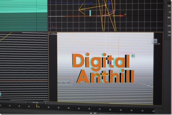
Once the flat vector was finished, I could then import it in to 3Dsmax. With a bit of extrusion and edge chamfering I had my 3D model. I set up a vRay scene and played around with different angels until I got the desired look.
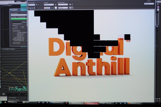
Here vRay is doing its thing..
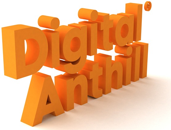
Below is the final high res render of the new logo.
Here’s another example of a slightly different idea for the logo..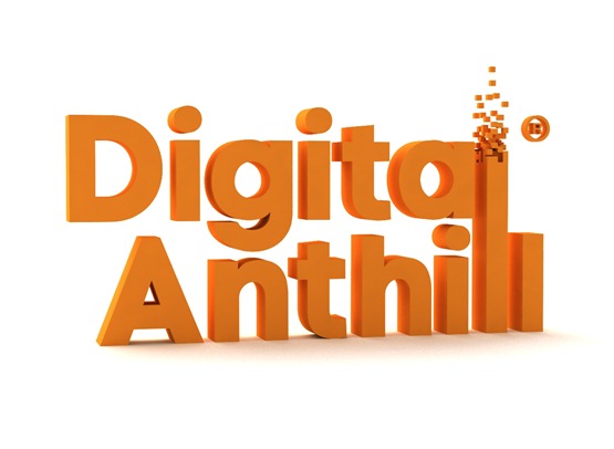
For the footer I created my very own digital anthill, it has a minecraft feel about it. I think the digital cube thing is going to be my new mark..
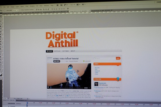
Once I had the 3D renders I then used Photoshop to lay out the the new blog.
With a bit of help from Greg, my house mate, we managed to get the new theme up and running.
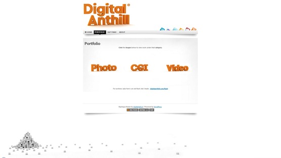
Below is the portfolio section of the new site. I’m pretty pleased with the clean and clear look.
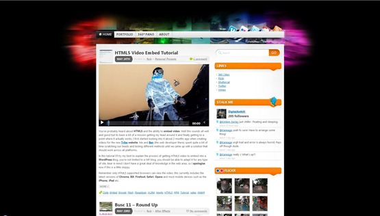
For the record here’s how the old site used to look, quite different to say the least..
I’m really pleased with how it’s turned out. I now finally have a logo and font that I can use through out my work from now on. There nothing like consistency 🙂
Let me know what you think..



Recent Comments