That’s right. After a year of work panodrop.com finally goes live. Its been a fun project but I couldn’t have estimated the amount of time, effort and not to mention money, it would take to get something like this up and running. All a valuable learning experience however.
Click MORE to get the ins and outs of this project.
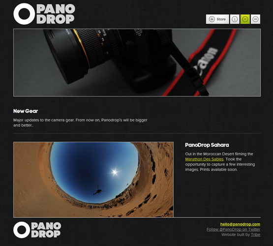
In my previous post about this project, the screen shots of the website look very different to the final thing. We decided that custom building an online shop was going to be too difficult. Instead we decided to make a fairly basic website with a shop feature embedded on. This meant more time should be spent on adding cool little subtle features like the navigation at the top.
Nav
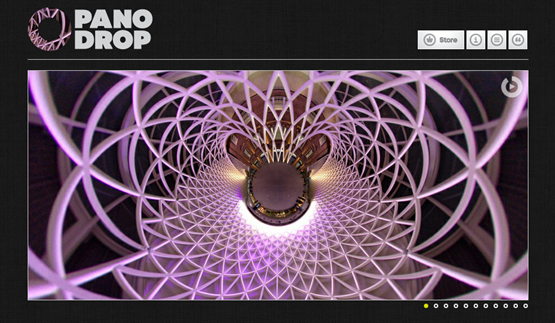
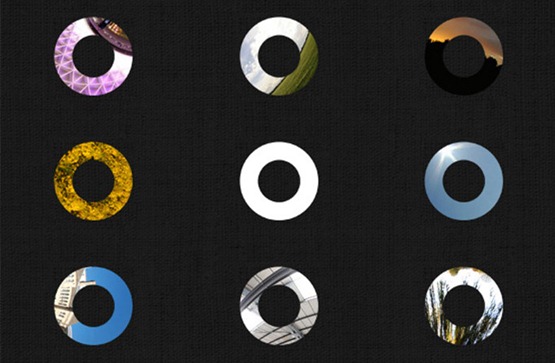
I wanted the logo to be interactive and dynamic. When the user hovers over any image on the site I wanted it to display behind the circle of the logo.
Matt at Tribe came up with a cleaver solution. It involved masks and lots of maths. It works a treat. If you haven’t already, go give it a try. See what abstract image you can create.

The nav at the top right is also interactive. When the user hovers over the icons it changes copy on the logo to the left. It was animated appropriately, with a dropping motion.
Shop
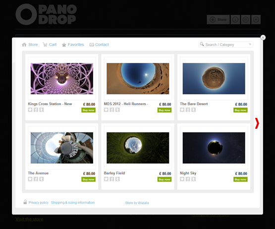
The store was a real issue. It was going to be a big mission trying to develop our own. Luckily I discovered Wazala. It’s a brilliant online store that allows you to embed to your site. The content management behind it is excellent also. This saved a lot of time and stress.
Prints
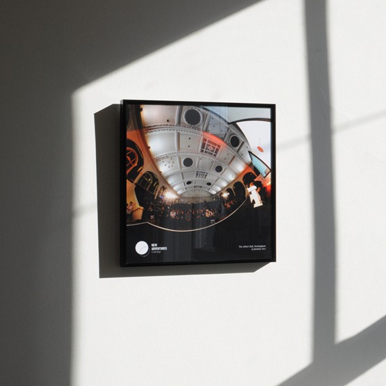
Making a decision on the prints was also tricky. I came to the decision that I would only sell the images in either 1×1 or 2×1 formats. The size of the square (1×1) image is 30x30cm or the same size as a 12” record and the 2×1 is 60x30cm. The frame was the next choice. After careful consideration I decided that a matt black aluminium frame with glazed front was the best way to display these images.
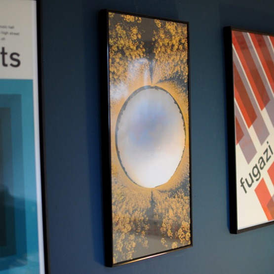
Below is first test example I had made. Was really pleased with the quality. Seeing these images printed is awesome. Because they contain more visual information than a regular image, there’s so much to look at when up close.
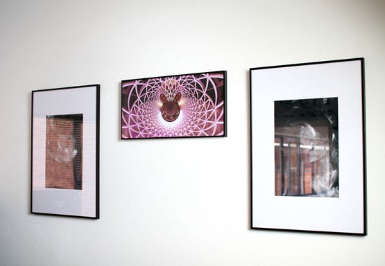
Below is an example of a 2×1 print but mounted in portrait. That’s another great thing with these images. Because they’re round, it doesn’t matter which way you hang them.
Here is another 2×1 frame but mounted horizontally.
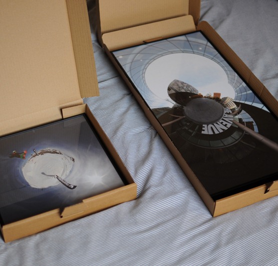
For the packaging I’m using (clean) unbranded pizza boxes. The prints fit in them perfectly. It’s a nice way to open the print. Has a bit of novelty feel about it.
Blog
The blog section of the site is pretty simple as blogs go. Its built using WordPress which means its easy to maintain. There’s no search or archive feature, its as simple as it can be. One hero shot at the top, then the rest of the post follow below. I wanted the images to align perfectly with the top nav so they feel like they disappear as you scroll. Instead of pages there is an infinite scroll, so more posts load as you reach the bottom of the page.
Information
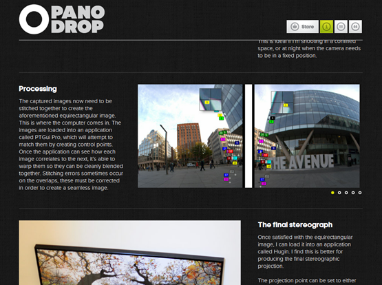
I often get ask how these are made. I wanted to have a page on the site dedicated to the process. Not giving too much away, but explaining the steps required to capture one of these images. This way I hope people can understand and appreciate what goes into them.
Items
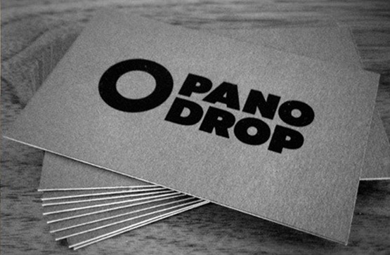
I have a selection of panodrop branded stuff. First up was the business cards.
I made them using three layers of high quality card from GFSmiths. I printed both sides then glued the three sections together and left it for a couple of weeks to set under pressure. The results are rather pleasing.
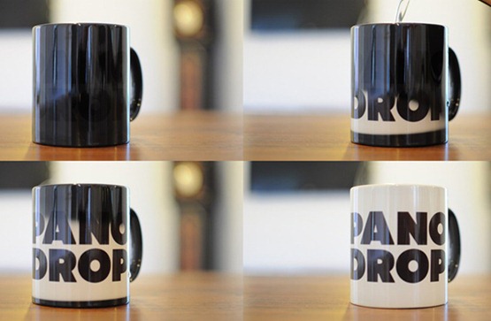
I had panodrop heat sensitive mugs made. Love these things.
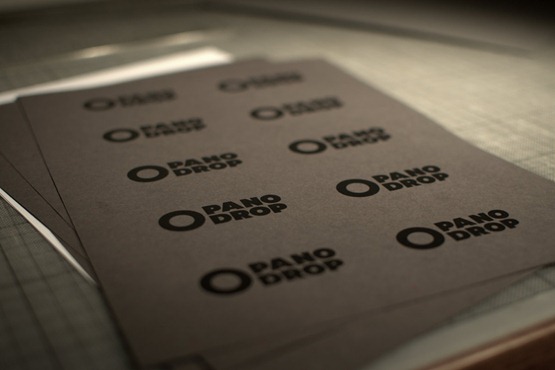
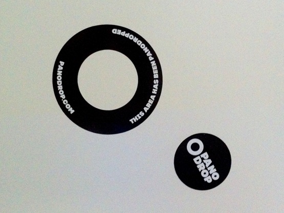
Also had some custom cut panodrop vinyl stickers made.
So yeah, its been hard work getting all this sorted, but Im super pleased with how its turned out. I now have a good base to promote and share these images with people. I just hope they are enjoyed as much as I enjoy making them.


Recent Comments